4+ years shipping consumer products end-to-end -- from Chrome extensions to AI agent UX.
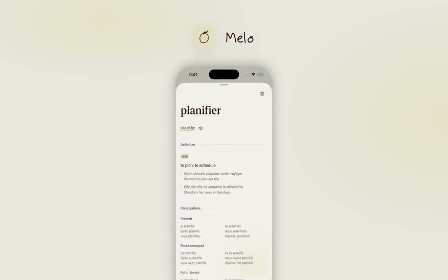
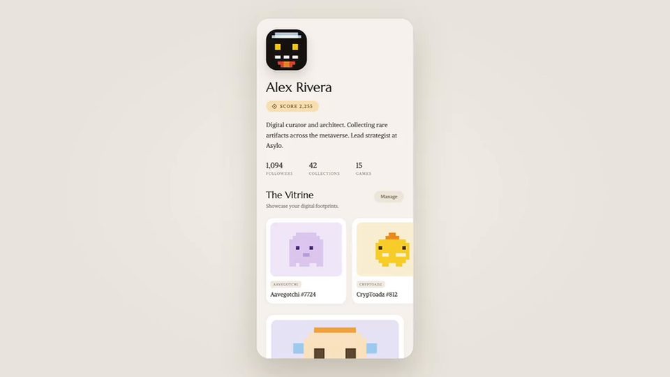
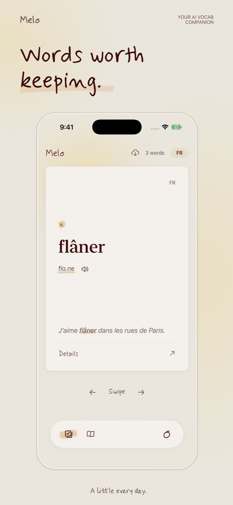
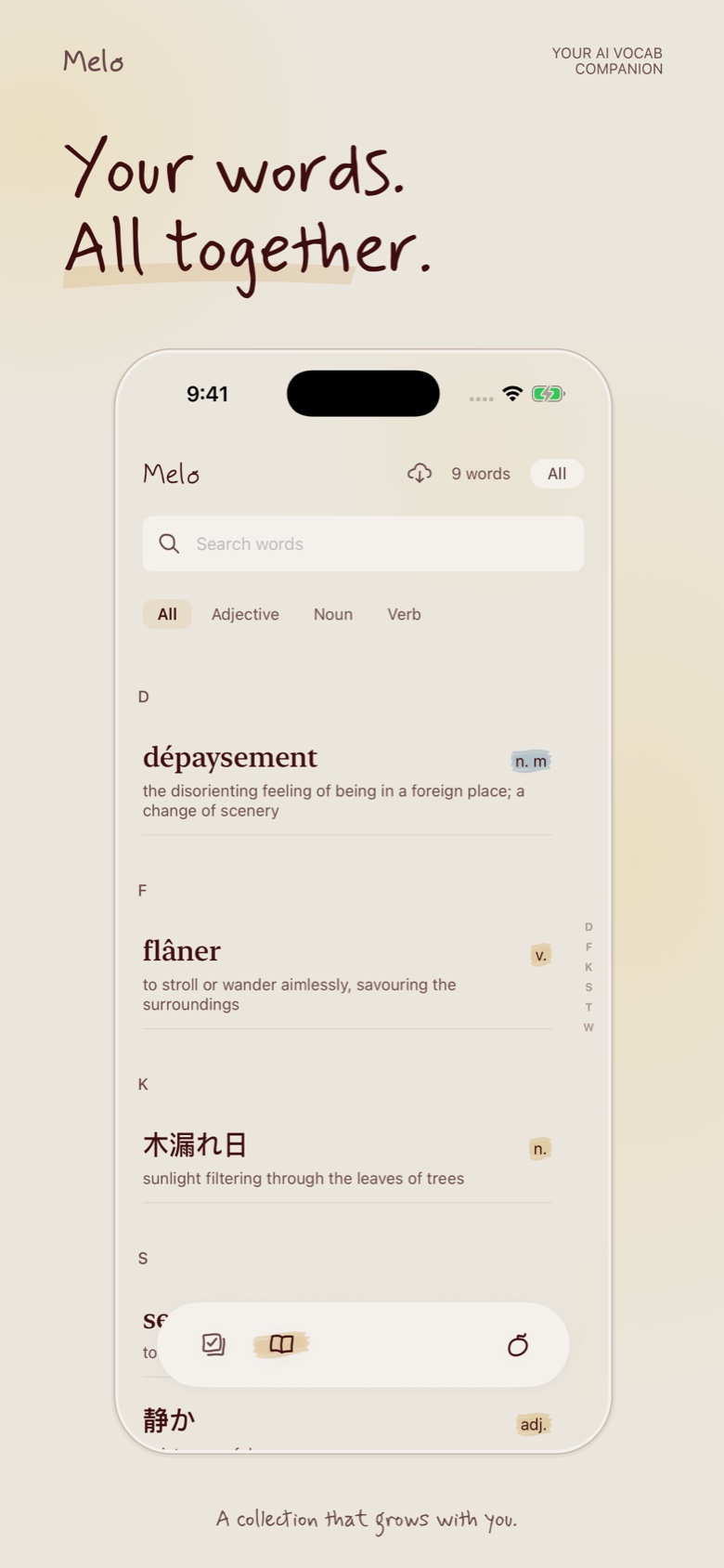
Currently shipping Melo -- a vocabulary tool that lives inside Claude.
I use Claude a lot. When I am reading something in French -- an article, a recipe, a film -- I ask Claude about words I do not know. Claude explains it well. I think: I should write that down. I do not. By tomorrow it is gone.
The problem is not that I lack a vocabulary app. I have tried them. Duolingo turns it into a game. Anki gives you a graveyard of flashcards for words you never actually cared about. Neither touches the two things that matter most in French: conjugation and grammatical gender.
The deeper problem: none of these apps know which words I actually encountered. They give you a list someone else decided was important. But the words worth learning are the ones that show up in your own life -- in the film you watched, the conversation you had, the thing you looked up at midnight.
The right place to capture a word is not a separate app you open. It is the moment you are already in -- the conversation with Claude. I was already asking Claude anyway. I just needed Claude to remember.
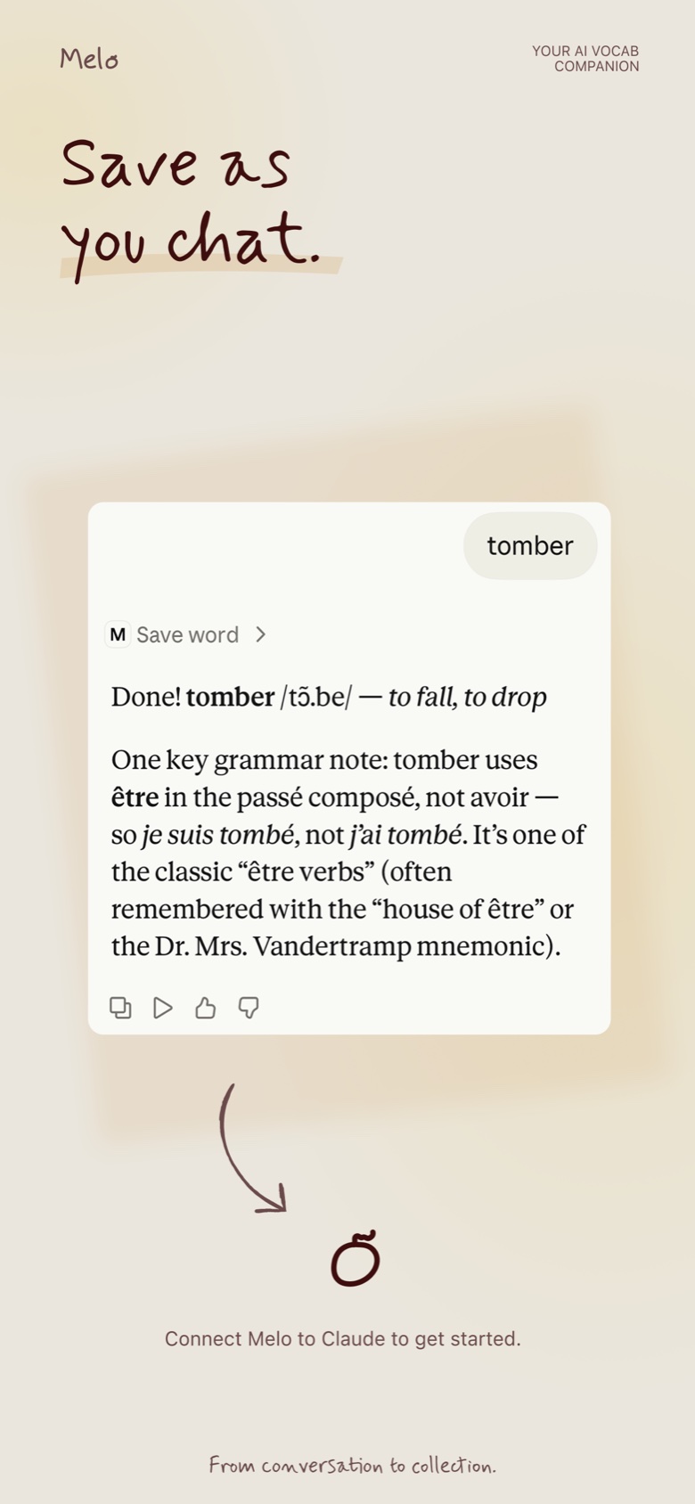
MCP made that possible. Connect Melo to Claude and it quietly saves every word you ask about -- the IPA pronunciation, an example sentence, the meaning, conjugation, grammatical gender -- automatically, in the background. No copy-pasting. No switching apps. The word shows up in Melo because you already asked about it. That is the whole interaction.
Built for people who watch French films, read Italian recipes, chat with an AI tutor at midnight.
Sign in with Apple, paste your MCP link into Claude's settings, and that is it.
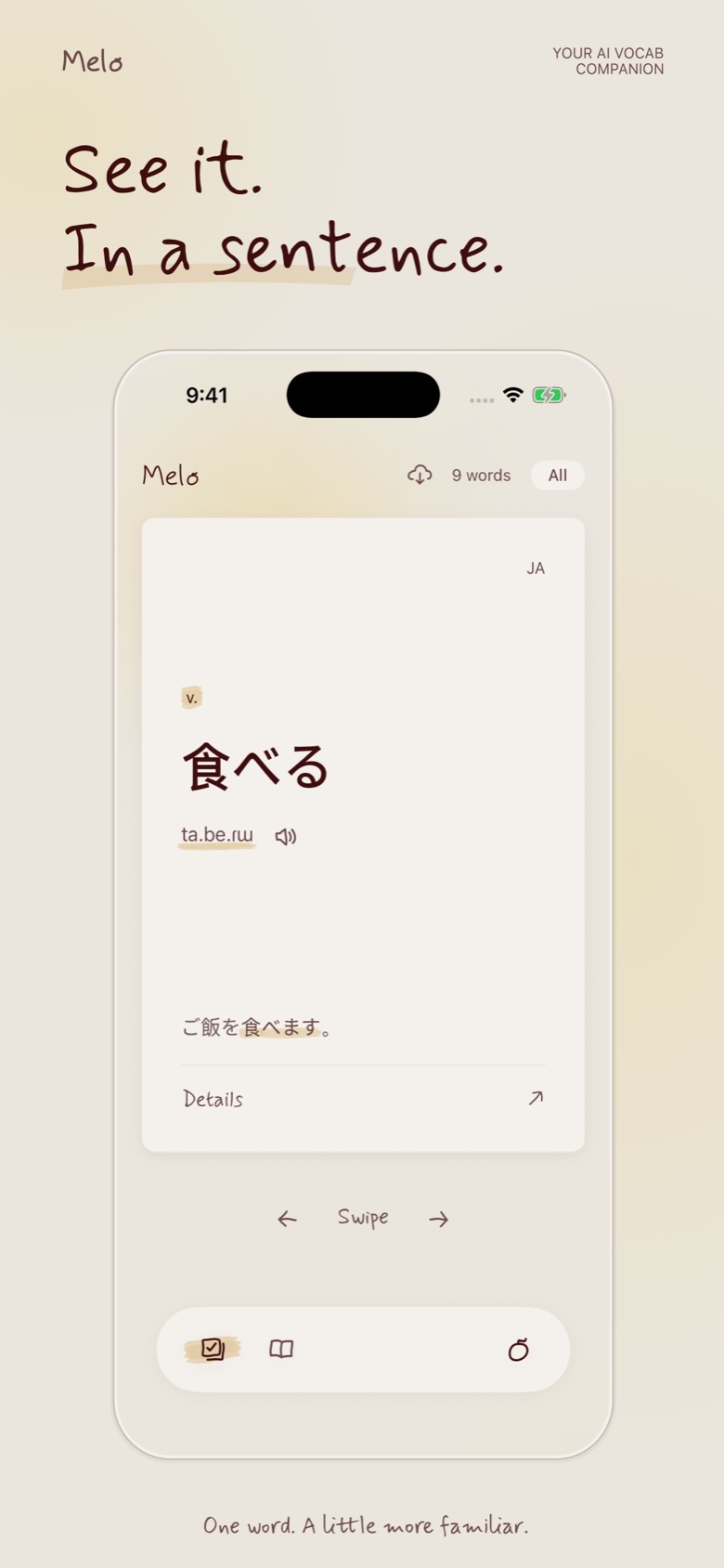
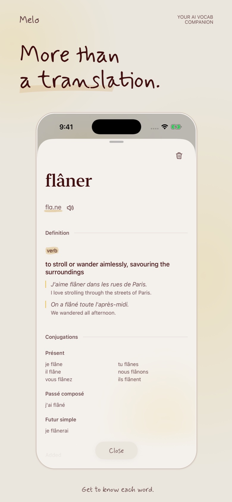
What is on a word card: Pronunciation, example sentence, conjugation table, grammatical gender. These four and nothing more. English translation is deprioritized -- the goal is to stay in the target language as long as possible.
Gender as color: Masculine and feminine nouns are color-tagged consistently. Gender becomes a visual fact you absorb over time rather than memorize consciously.
Flashcard design: The card tests conjugation, not definition. Most apps ask "what does this mean?" -- Melo asks "how do you use it?" A deliberate departure from the Anki model.
No word lists: Melo does not give you a curated list to work through. It only shows you words you actually encountered. The words worth learning are the ones that already showed up in your life.
The sync UX: The hardest problem was making the Claude-to-Melo connection feel invisible rather than bolted on. The word should feel like it was always there.
Melo is live on the App Store and in submission to Claude's Connector Directory. Download on the App Store, connect to Claude, and ask about any word in French, Spanish, Italian, or Japanese.


Most product design assumes the user is the one taking action. The interface is a surface for human decisions. What happens when the AI is the actor?
At an AI startup in 2025, I designed an AI agent that could manage a user's investment positions on their behalf.
Transparency vs. noise: Showing every AI decision creates log fatigue. Hiding decisions creates distrust.
Control vs. automation: Every intervention UI you add undermines the value of the AI. The upfront configs -- the prompt, the constraints, the operation styles -- need to be expansive and deliberate. Once that step feels owned, the runtime feels earned rather than imposed.
Trust signals: Whether it is a smart contract or any other constraint -- the real safety harness is invisible because users cannot see code. The design challenge is making a technical guarantee feel human: legible limits, not reassuring copy.
The concept: an AI that could safely manage investment positions on your behalf. Hard constraints enforced by smart contracts -- not just UI affordances -- meant the AI could not spend more than you had configured. A genuine architectural safety guarantee, not a design-layer promise.
The interface looked like a messaging app. Deliberately. If you are going to have an AI managing your money, natural language is still the most flexible way to express what you want -- "take profit if we're up 20%" is clearer than any form UI. I used in-chat interactable widgets for quick actions that needed precision: confirm a transaction, check a live market chart, review a position. The chat handled intent; the widgets handled execution.
The agent needed to report what it did -- a trade, a rebalance, a stop hit -- in a way the user could scan without reading. That ruled out a couple of obvious layouts first.
Two versions came before the final solution, and both had a failure mode. Pure chat buried state in scrollback -- a rebalance confirmation would scroll past, and the only way to check whether a trade stayed within limit was to ask again. Pure dashboard solved for scanability but lost the agent entirely -- numbers updated with no visible reasoning behind them, and any edge case outside the preset views had no way to surface. It read like a legacy trading terminal with better colors.
The fix was not choosing one. Chat carried intent -- the "why," the edge cases, anything that didn't fit a fixed layout. Widgets carried fact -- trade executed, limit used, trailing stop hit -- rendered as structured state, not prose the user had to parse. A constraint like a $5,000 hard limit didn't need a sentence explaining it was safe. It needed to sit on screen as a number with headroom shown, so the user could see the guardrail rather than be told about it.
The component library behind the prototype -- chat bubbles, actionable confirm cards, execution receipts with limit-usage bars, market signals, P&L chart, navigation + status, journal calendar.
#5e5ce6
#222150
#55b98a
#e08573
#16161c
#e8e8ef
#8f8f9d
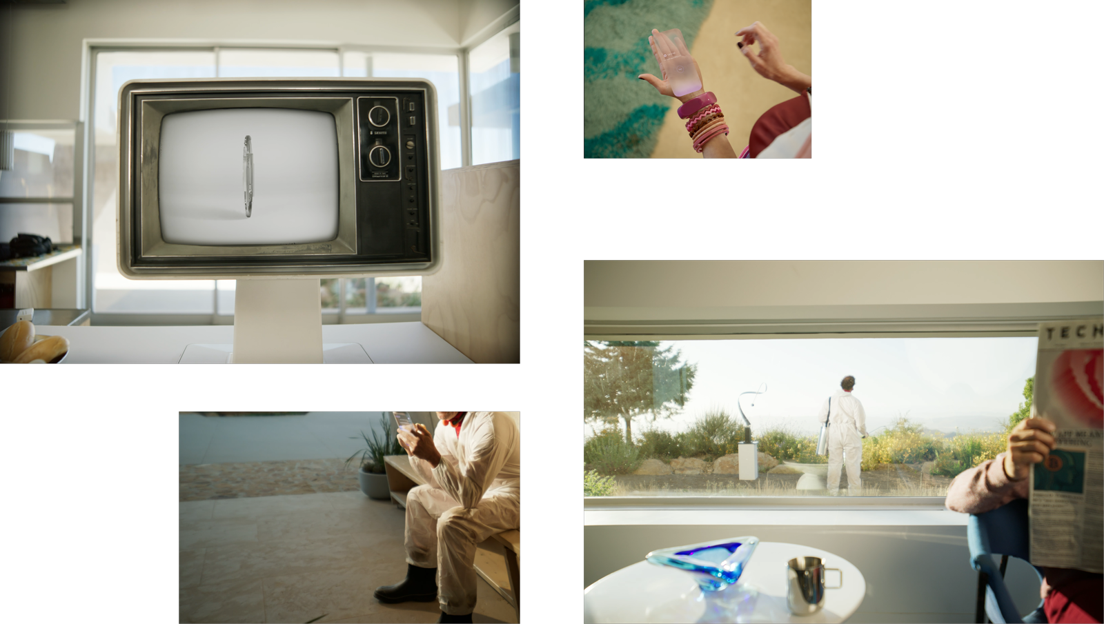
I art directed the video for this product. It was live action, post-futurist western. The setting sits somewhere between frontier town and near-future city. Characters with 80s silhouettes -- leather, volume, a little theatrical -- inside a world that is clean, architectural, slightly cold. The tension between those two aesthetics was intentional: familiar human warmth inside an AI-managed system.
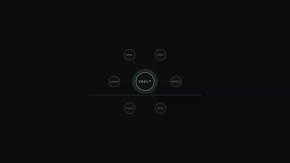
A fund with no human portfolio manager. An AI agent runs it instead -- allocating and rebalancing 24/7, awake in every timezone. What does a user need to trust a fund they can't call anyone about?
Configuration vs. intent: Traditional fund platforms ask you to configure parameters -- risk tolerance, allocation limits, rebalancing rules. Parameters are precise, but they flatten a strategy no one actually thinks in.
Autonomy vs. oversight: The entire value of the product is that it runs without you. Every checkpoint added before it acts erodes that value -- but zero checkpoints means committing capital to a strategy never actually confirmed.
Trust signals: The real safety harness -- constraints enforced at the contract level -- is invisible because users cannot see code. The design challenge is making a technical guarantee feel human: legible limits, not reassuring copy.
Think of a fund platform where instead of a human portfolio manager running each fund, an AI agent runs it. Users could initiate a vault with a prompt -- an investment style, a risk threshold, a market thesis -- and the agent would allocate and rebalance the vault 24/7 within those parameters.
Early tests showed something genuinely useful: the agent could detect abnormal market signals and exit positions safely ahead of volatility -- something a human manager sleeping in a different timezone simply cannot do. Early performance data showed returns comparable to or higher than equivalent human-managed funds -- at a fraction of the management cost. And because the constraints were enforced at the contract level, the vault was structurally more secure than a human-managed equivalent.
Users needed to set a strategy without learning a settings panel, and the vault needed enough structure to actually execute it. Two versions came before the final solution, and both had a failure mode.
Manual configuration -- risk tolerance, allocation caps, rebalance rules as separate fields -- was precise but forced a strategy into a vocabulary no one thinks in. A market thesis doesn't decompose cleanly into sliders. Freeform prompt with no review step solved that, but removed the one checkpoint that mattered: nothing told the user whether the agent understood "aggressive" the same way they meant it before capital moved into the vault.
The fix kept the prompt and added the missing checkpoint. The agent reads intent and extracts structure -- risk band, allocation limits, rebalance triggers -- surfacing a confidence score on each parameter before the vault goes live. A high-confidence read needs no attention. A low-confidence one gets flagged for the user to correct. The confirm step isn't filling in fields; it's verifying the agent understood the thesis.
Three views into the working build -- prompt-based vault creation, runtime performance + decision log, and an AI generated onboarding animation.
Prompt-based. Describe a strategy in plain language; the interface extracts the confidence-scored parameters covered above and asks for confirmation, not configuration.
Live vault performance paired with a running log of what the agent did and why -- each rebalance, each exit, timestamped and reasoned. The dashboard shows what changed; the log shows why it was allowed to.
An AI-generated animation sequence introducing the vault concept before a user commits capital -- explaining the constraint model without a wall of copy.
This video was motion graphics -- I designed the product and then built the video myself in After Effects and Cavalry. The systematic visual language was a deliberate extension of the product's logic: structure over character.
The startup's whole thesis was that identity should be open and portable -- readable across platforms, not locked behind a login. That held up online. In person, at an open-house event, it broke down completely. Two people could stand three feet apart with no way to see what the other had built, what they believed, or whether the conversation was worth having. The thing the product solved on a screen didn't exist in the room.
Physical vs. digital: a QR code on a badge is technically the same function, but nobody scans a badge mid-conversation. It needed to feel like a wristband worth wearing, not a barcode.
Instant vs. earned: the tap itself had to be one motion, no app to install, no friction. But the social layer on top of it -- endorsing someone -- needed enough weight that it read as real, not a spam button.
Private vs. performative: an endorsement is public by design. It had to feel like genuine social credit, not a popularity contest.
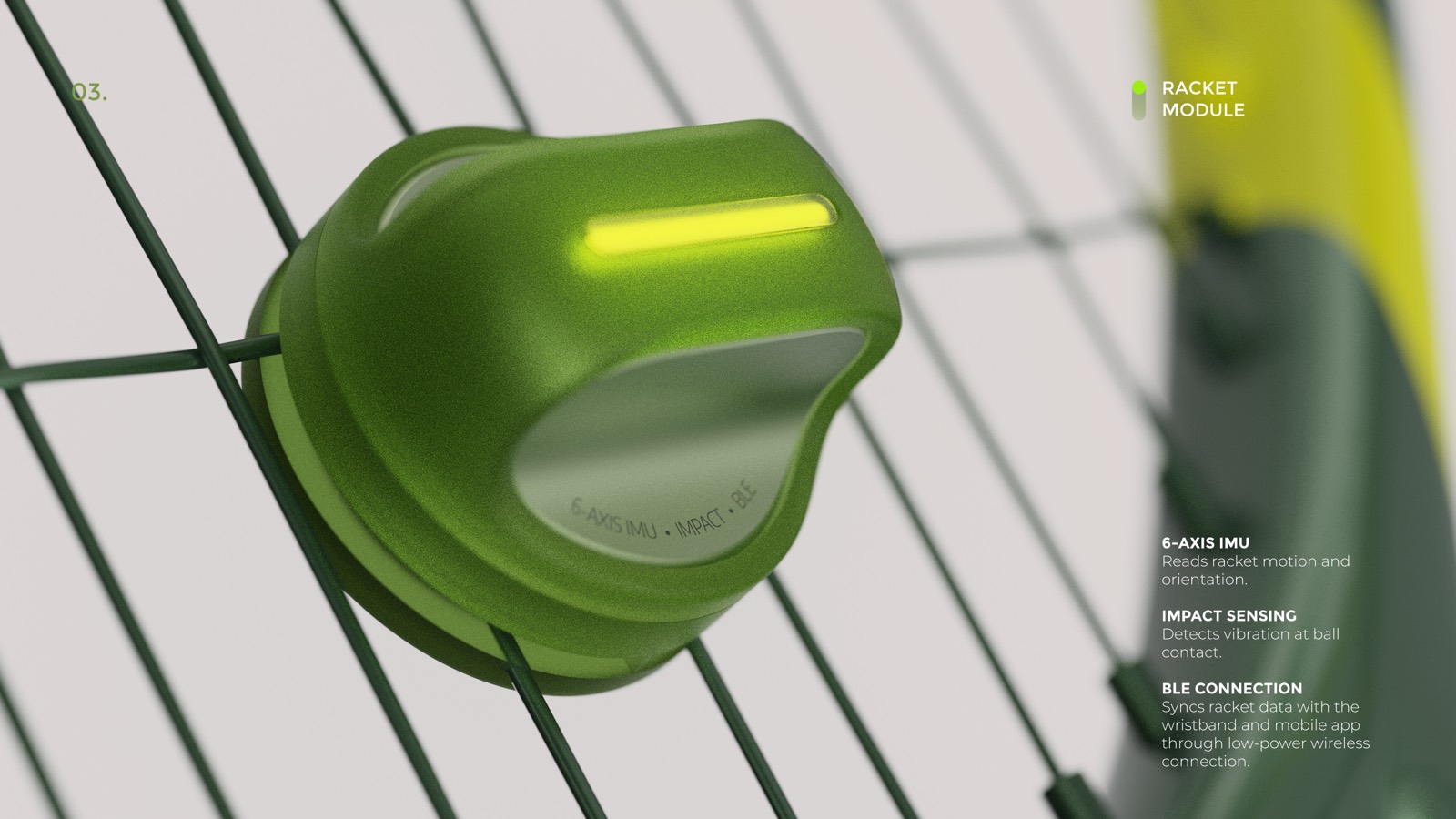
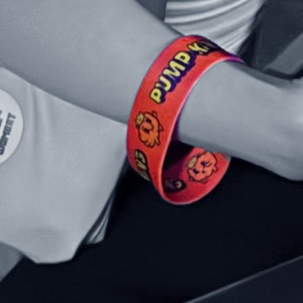
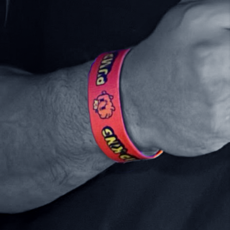
A custom NFC wristband, worn at three open-house events over two years. Tap it to another attendee's phone and their social profile opens instantly -- the same open-identity system the product ran online, now readable through a handshake. Attendees could endorse each other, which moved them up a live leaderboard running on a screen at the venue.
It was a physical expression of the same identity thesis the product was built on -- and it was the one piece of the whole event that people actually kept playing with.


Two versions came before the final one, and both had a failure mode.
A QR code on an event badge was the obvious first pass -- cheap, no hardware. It failed because looking someone up meant pulling out a phone, opening a camera, and aiming it at their chest. That is a transaction, not a handshake, and almost nobody did it twice.
A dedicated event app was the second pass. It failed faster: nobody installs a one-off app for a single day, and the app-store friction killed adoption before a single tap happened.
The fix dropped both. An NFC wristband works with a phone's existing NFC reader -- no install, no aiming, no separate object to hold. It stays on the wrist for the whole event, so "let me look you up" becomes a literal tap instead of an interruption. The leaderboard gave people a reason to keep tapping past the first one.
Concept, wristband design, and art direction for the physical object and the tap-to-reveal flow. Deployed across three events -- Denver (2023, 3-day format, 1,200+ attendees), Singapore (2024, Google APAC HQ, 1,500+ attendees), and Bangkok (2024, 2,000+ attendees) -- 4,700+ attendees combined.
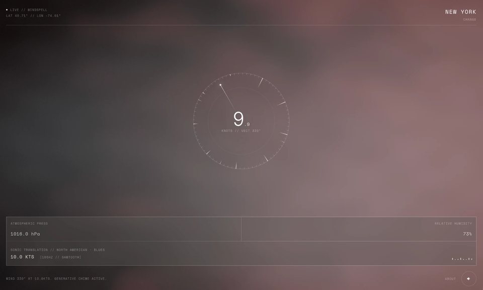
Every city has wind. Wind has speed, direction, pressure, humidity. None of that is music -- but all of it is data with shape and rhythm.
Windspell asks: what if a city's live weather became a generative instrument? Not a visualization, not a graph. A sound you could actually sit with.
Type a city. The app looks up its coordinates, derives a musical scale from the cultural region, and hashes the city name to a root note. Then it starts polling the weather API.
The visual center of the app is a ring of 72 tick marks -- a physical kalimba model. Nine of those ticks are active tines, each tuned to a scale degree. The ring rotates continuously. Wind speed controls how fast it spins. A needle sits fixed at the live wind direction. When a tine crosses the needle, it gets plucked.
Wind speed is tempo. Wind direction is which note plays. That is the whole mechanic.
14 musical scales are mapped to geographic regions by latitude and longitude bounding boxes -- Aeolian for Nordic latitudes, Hijaz for the Middle East, Yo for Japan, Blues for the American South, Slendro for Southeast Asia. The root note comes from a djb2 hash of the city name modulo 12 chromatic semitones above C3.
Pressure, humidity, and gust data then modulate the audio continuously. High pressure brightens the filter. High humidity stretches the reverb tail. Gusty wind adds harmonic overtone content. Wind direction shifts the stereo pan field.
Chord voicing follows the region's timbre. Cold regions (Arctic, Nordic, Andean) voice an open 4th plus a sparse 6th, with long reverb. Warm regions (European, Mediterranean, Blues) voice a full triad. Bright regions (African, Japanese, Oceanic) use a clean open fifth only.
The result: Cairo and Reykjavik do not sound alike. They use different scales, different root notes, different waveforms, different reverb lengths. The same city sounds different at dawn versus midnight -- the background shader uses a real solar position algorithm, so the lighting shifts with actual sun position.
The wind bed itself is AI-generated. Instead of a fixed sample bank, the app describes the current conditions in natural language -- "steady moderate wind, with rain pattering, natural field recording texture, seamless loop" -- and sends the prompt to ElevenLabs' Sound Effects API, which synthesizes a 22-second loopable clip on demand. Every city/weather state gets its own ambient texture, generated in real time.
Generation is bucketed, not continuous. Wind speed folds into five tiers -- calm through gale-force -- crossed with weather modifiers like rain, snow, and fog. A new clip is only requested when conditions cross into a meaningfully different tier, not on every weather poll, so API usage stays lean. The key never reaches the client -- requests route through a Vercel edge function proxy.
On the client, the clip decodes through the Web Audio API and layers into the synthesis engine alongside the kalimba: blended through a compressor to normalize loudness across independently generated clips, and volume-mapped to live wind intensity on a perceptual power curve rather than a linear one. Each loop crossfades into a fresh iteration a few seconds before it ends -- sidestepping the gap you'd hear from naive loop playback of an MP3.
DATA
ROTATION
PLUCK
NOTE
AUDIO
| PARAMETER | RANGE | AUDIO EFFECT | FORMULA |
|---|---|---|---|
| PRESSURE | 960 → 1040 hPa |
Filter brightness Low pressure → murky, dense High pressure → bright, open |
cutoff × (0.75 + Δp × 0.5) |
| HUMIDITY | 0 → 100% |
Reverb wet mix + tail length Desert → short, direct Tropical → long, diffuse |
wet = 0.20 + h × 0.35 tail × (0.6 + h × 0.8) |
| GUSTS | 0 → 2× wind speed |
Harmonic overtone content Turbulent air → richer texture 2nd oscillator at 2× freq |
g = (gusts−spd)/spd harmonic += g × 0.20 |
| WIND DIR | 0° → 360° |
Stereo pan offset N wind → field shifts left S wind → field shifts right |
pan += sin(dir_rad) × 0.15 |
Long reverb (2.4–3.5s).
Mid reverb (1.1–2.0s).
Short reverb (0.4–0.7s).
The resonator form was not the obvious first choice. Five directions were explored -- a breathing circle, concentric orrery rings, radial petals, a Lissajous curve, and soft diffused arcs. The concentric ring model survived because it was the only one that directly modeled the physical mechanics: a ring sweeping tines past a fixed needle is exactly how a kalimba works. The visual and the audio became one system.
Webcam and cloth simulation were scoped early and removed. A fully procedural GLSL shader -- driven by cultural region hue, live weather uniforms, and solar position -- is faster, more reliable, and creates a more distinct visual identity than a background feed.
WINDSPELL // RESONATOR DESIGN OPTIONS
Three.js for the fullscreen GLSL shader. GSAP for the Resonator ring animation and tine bend physics. Web Audio API for the synthesis chain -- oscillators, bandpass noise, convolver reverb, stereo panning, biquad filter. OpenWeatherMap for live wind data, polled every 60 seconds. ElevenLabs Sound Effects API for the generated wind bed, proxied through a Vercel edge function.
The audio chain runs a continuous drone at half the root frequency and bandpass-filtered wind noise that scales with wind speed. Per-pluck notes layer on top: the main oscillator, a harmony note from the chord voicing, and an overtone oscillator that scales with gustiness. Everything routes through a master gain with a wet/dry reverb split that rebuilds when humidity shifts significantly.
A stylophone is a pocket synth you play by dragging a stylus across a small metal pad. Playing one, the thing I keep snagging on is that I am not really making a sound -- I am triggering one that already exists, orchestrating a fixed sampler. What if the movement itself made the sound -- what if a mark on the pad generated the sample directly, instead of picking one off a shelf?
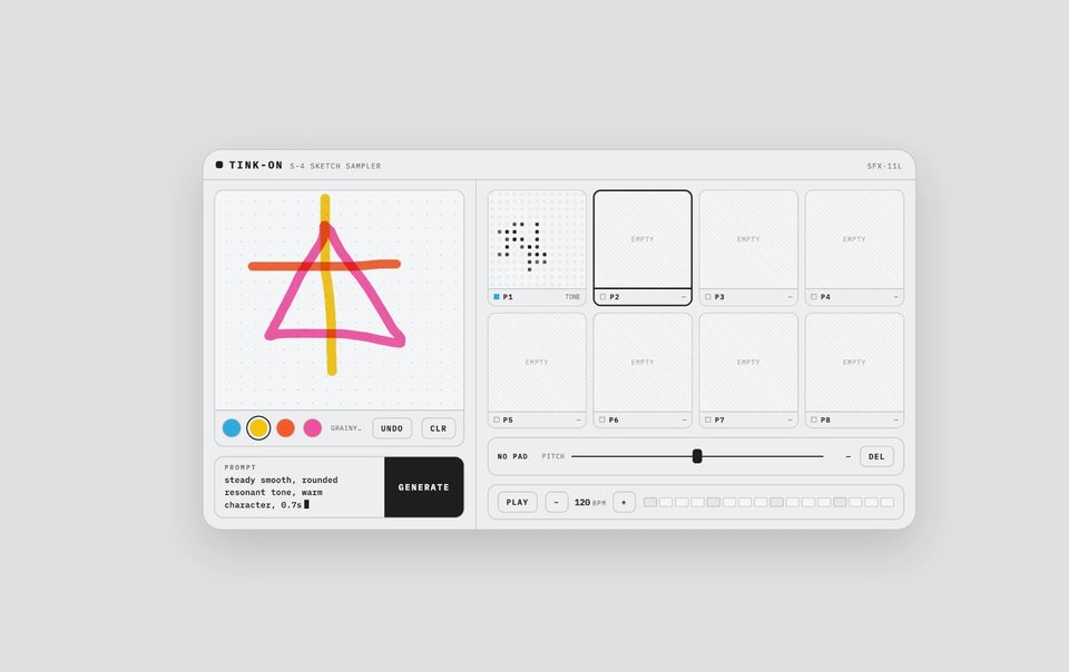
You can hear a texture in your head -- short, bright, jagged -- long before you could name it a "band-passed noise burst with a fast filter wobble." So Tink-on starts from the drawing. You sketch a mark, and its color, height, length, speed, and jaggedness become the sound. The drawing is the prompt.
Four inks, each a timbre family: blue is a resonant tone, yellow a grainy texture, orange a metallic impact, pink a deep sub drone. You draw with wide risograph-style strokes that multiply-blend where they cross -- blue over yellow reads green, the way overlapping riso passes do on paper. The color you drew the most of wins.
The stroke's geometry sets the rest. Height on the paper maps to pitch (80--880 Hz), total drawn length to duration (0.25--1.6s), drawing speed to how fast the sound flutters, and jaggedness to how gritty and detuned it is. Those features compile into one readable line -- "fluttering jagged, gritty metallic impact, bright airy character, 0.8s" -- shown on the panel's LCD. That line is the actual prompt.
Press generate and the sound lands on one of eight pads. Each pad can be pitched a full octave either way and played by tap or number key. Start the transport and tapping a pad records that hit into a looping bar, so you build a beat by playing it in.
The whole instrument is drawn in a Dieter Rams register: a quiet, functional panel where every control does one legible job and nothing is on screen to decorate. It stays deliberately flat -- matte fields, hairline rules, no gradients or drop shadows doing mood -- closer to a screen-printed control surface or an ink display than a glossy app. All the colour and texture is spent in one place, the drawing: the strokes are risograph on purpose, grainy inks that overprint into new hues, the one warm, tactile surface in an otherwise cool, flat instrument.
A filled pad needs its own identity at about the size of a postage stamp, and it should tell you which sketch made it. The first version put a downscaled snapshot of the sketch on the pad; a thin drawn line shrunk to that size is a gray smear, indistinguishable from any other.
The second direction dropped the snapshot for a generated shape -- a bold form seeded from the sketch's features, filled first with a black halftone and later with a swirling field of short strokes. It was legible and every pad looked distinct, but it was the wrong kind of distinct: the mark was a decorative token derived from the sketch, not a picture of it. A pad no longer showed you the drawing it held, so at a glance you could not tell your pads apart by what you had actually drawn.
The version that shipped pixelates the real sketch. Each pad is a small square "magnetic drawing board" -- a coarse grid of rounded-square cells. The drawing is sampled cell by cell: cells you drew over become solid, unsketched cells stay faint, and each ink color maps to a shade of gray by how much of it you used, so a one-color sketch is plain black and a mix reads in tiers. It is a low-resolution portrait of the drawing rather than a stand-in for it, which is the whole point -- the pad looks like the thing you made.
The prompt line goes to ElevenLabs' Sound Effects API, which is built for one-shot textures and impacts and accepts clips as short as half a second -- close to the range a sampler hit needs. A small Vercel function holds the API key server-side; it never reaches the browser.
The assignment came out of Parsons' MS Data Visualization program working with The Met's Open Access API, and it was deliberately open: interpret the Museum's public-domain collection -- every object with its full catalogue record -- into something thoughtful about a topic of your choice, then present it to the Met's own Digital Department.
Out of everything, I picked the ceramics, for a specific reason: they are the collection you most want to touch. A fired body rings or thuds depending on how it was made -- glaze, clay, temperature -- so the material is half the object, and half of it is exactly what a museum takes away. Behind glass, ceramics are untouchable and silent; the two senses that would tell you the most are the two you are never allowed. These are two ways to give them back -- one lets you see the whole collection at once, the other lets you hear what it is made of.
The Met ran the Lookbook as the cover of its own write-up on the collaboration.
The idea came from mosaic -- thousands of small fired tiles that only become an image when you stop looking at any single one. A museum collection works the same way at a distance: at maximum zoom-out it is nothing but its colour.
The Lookbook lays out all 51,521 public-domain Met ceramics as tight crops of their own glazed surfaces -- not photographs of vases, the surface itself, the part you would run a thumb across. Sorted by hue, the collection reads as one continuous gradient from cobalt through turquoise, celadon, terracotta, iron red and ochre to manganese black. You filter it by glaze family, material and department, and you zoom: from a single catalogue card out to the overview, where all 51,521 objects sit on one screen as flat swatches of colour -- the entire collection as a single mosaic.
The interface is built from the same pigments as the objects -- bone, ink, mustard, terracotta are interface colours and glaze families at once -- and floats over the field as frosted specimen labels rather than a docked panel, because only a heavy blur lets a delicate interface sit on top of 48,000 competing surfaces without going muddy.
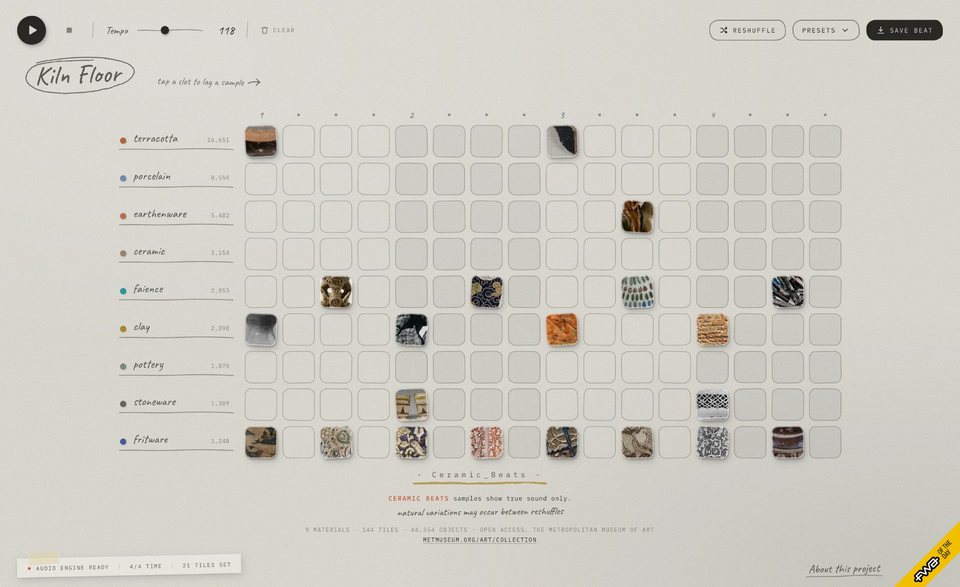
The idea is older than the dataset. As a kid you tap the rim of a bowl or the side of a mug and each one answers at its own pitch -- a cupboard of dishware is quietly a set of tuned bars. Ceramic Beats takes that reflex and points it at a museum's worth of ceramics.
It is a step sequencer with nine tracks -- one for each material the Met's catalogue names, from terracotta down to fritware. Every pad is a real object of that material, cropped from its photograph, and it sounds like that body being struck. That is not a metaphor: firing temperature and porosity govern how long a body rings, so unfired clay is dead, low-fired earthenware thuds, and the vitrified bodies -- porcelain, faience, fritware -- ring like the glass they nearly are. Across the nine, brightness runs 236Hz to 6,219Hz and ring from 55ms to 239ms.
The nine strikes are generated with ElevenLabs -- one per material, each prompted from a physical description of that specific body being hit, then trimmed back to the onset so the attack lands exactly on the beat. Click a pad to set a step and hear it, drag to paint a run, space to play. Hovering names the object; option-clicking opens it at The Met. Save Beat packs the whole arrangement into 30 bytes of URL, so a beat is just a link.
Token costs are invisible. You send a message, something happens, compute is consumed -- and you never feel it. The abstraction is total. For most users this is fine. But for people building on top of LLMs, or just thinking carefully about their AI usage, the invisibility creates a strange disconnect.
Paguro is a small terminal app and macOS widget that converts your token consumption into an in-world currency -- "pp" (paguro points). Spend tokens, earn pp. Use pp to feed your creature, buy it a new shell, keep it alive. Abstract API costs become something you can see, feel, and even care about a little.
Most AI product design is about removing friction and hiding cost. Paguro goes the other direction -- it makes cost visible, but translates it into something playful rather than stressful. The design question is: how much visibility is useful before it becomes anxiety-inducing? Where is the line between awareness and guilt?
There is also something worth exploring in the creature format specifically. A tamagotchi-style companion that depends on your AI usage creates a relationship with your tooling that is genuinely different from a dashboard or a usage meter. It is not extractive -- you are not being warned or penalized. You are just... tending something.
Very early. The concept is clear, the mechanic is defined, early prototyping is underway. No public release yet. Included here because the design thinking is real even if the product is not finished.
I think the most interesting design problem right now is the one nobody has a pattern for yet: what does an interface feel like when the AI is the actor?
Not "here is a chatbox." Not "here is an AI feature inside your existing product." But: the AI just did something on your behalf. It made a call. Now what? How do you design for trust, for legibility, for the user's sense of agency -- when the decision was not theirs?
I have been living inside that question at a startup where AI agents managed real money on behalf of users. No established patterns. You figure it out or the product fails.
I have a stats background (UMich) and a data visualization degree (Parsons). I code what I design. I built Melo -- a vocabulary tool on the App Store that connects to Claude -- because I was learning French and nothing handled conjugation and gender well. That is roughly how I work: see the problem, build the thing.
- Founding designer across 3 consumer products end-to-end: Chrome ext -- web app -- iOS + Android
- 60k users in 5mo (identity ext.) -- 320k website visitors -- full design system ownership
- Designed NFC networking hardware + companion web app for 3 events across Denver, Singapore, Bangkok (4.7k+ attendees)
- Creative directed brand relaunch + animated explainer series; art directed launch video (AE + Cavalry)
- 2025 spin-out: product design lead for AI agent investment platform and iOS trading app
Design: Figma -- design systems -- interaction design -- motion direction -- motion graphics (AE, Cavalry) -- brand identity
Build: React -- HTML/CSS/JS -- Swift -- MCP server development -- Blender
AI: Claude API -- MCP integration -- AI agent UX
Other: developer relations -- event production -- creative direction
Languages: Mandarin -- intermediate French & German -- conversational Japanese